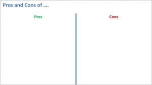
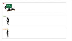
Rows Work Better Than Columns
To help engage learners and encourage them to interact during their live virtual training, we often create a slide and ask them to add text ideas to the slide. We might just have a title and encourage them to add ideas to the entire slide or maybe you want them to categorise their ideas under 2 or 3 headings. In a face-to-face environment, we would have a flip chart sheet, landscape on the wall with a line down the middle. Because of this, we replicate it on-line. Something like:
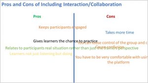
But, the issue on-line is that learners often struggle keeping their text annotation within the width of the column.
Causing:
- The slide to become difficult to read.
- Learners focusing and worrying more about formatting and editing their text to keep it within the column than the ideas and suggestions being generated.
- The trainer busy trying to keep the slide tidy by moving text around.
Try Using Rows Instead of Columns
If we use rows to separate the headings rather than columns we make things easier for our learners and ourselves.
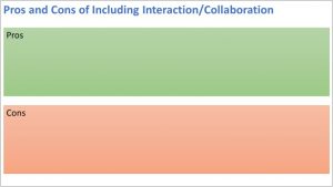
With rows
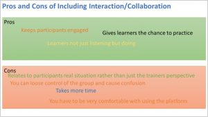
- There's plenty of space to add text without it crossing into another column.
- Learners can focus upon the ideas being generated.
- Easy to read.
Here's 2 more examples
Example 1
Example 2

It's a simple tip but works perfectly for live virtual training.
Call To Action
When you're designing interactive slides for learners to categorise their ideas, use rows rather than columns.